The Security Compliance Dashboard gives you a consolidated, real-time view of violations, remediation activity, and risk across all your connected applications. It brings together summary metrics, trend analytics, and the most recent alerts on a single page. Data is refreshed every hour.
Time period & date filter
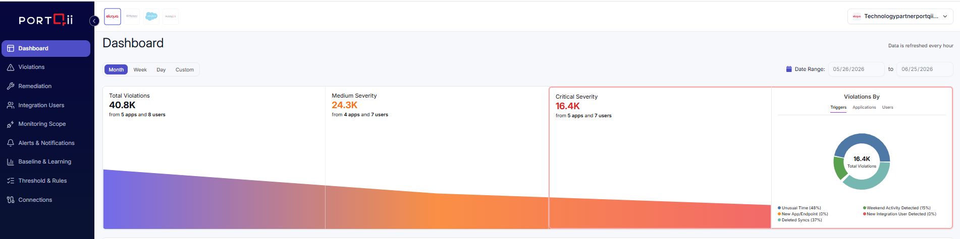
A toolbar at the top of the dashboard controls the period that the analytics reflect. Use the time-period dropdown to choose:
- Month — the last 30 days
- Week — the last 7 days
- Day — today
- Custom — a date range you define
When you select Custom, the Date Range fields become active so you can pick a specific start and end date. For Month, Week, and Day the range is set automatically.
Violation metrics
The metrics section summarises violations for the selected period across three cards:
- Total Violations — the overall count
- Medium Severity — medium-severity violations
- Critical Severity — critical violations (highlighted)
Each card also shows a breakdown of how many apps and users the violations came from (for example, “from 4 apps and 7 users”).
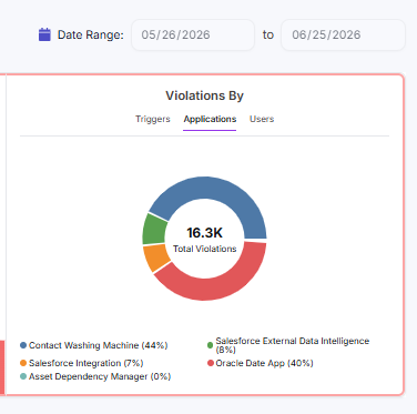
Alongside the cards, the Violations By donut chart breaks down the total. Use the tabs above the chart to switch the breakdown between Triggers, Applications, and Users. The legend lists each segment with its percentage.
Remediation Trend
The Remediation Trend chart plots remediation activity over time so you can see how violations are being resolved. It shows two series:
- Automatic (green) — remediations applied automatically by configured rules
- Manual (indigo) — remediations performed by an administrator
The horizontal axis shows dates and the vertical axis shows the count. Hover over the chart to see the values for a given day.

Exposures by App & Top Risky Users
Two analytics panels sit side by side:
- Exposures by app — a card for each application showing its logo, name, a small trend chart, the number of findings, and a trend badge. An upward arrow (red) indicates an increase and a downward arrow (green) indicates a decrease versus the previous period.
- Top risky users — the users with the highest risk, each shown with an avatar (colour reflects severity), the user name, the number of Risky apps, a trend badge, and the number of Total apps.

Recent Alerts
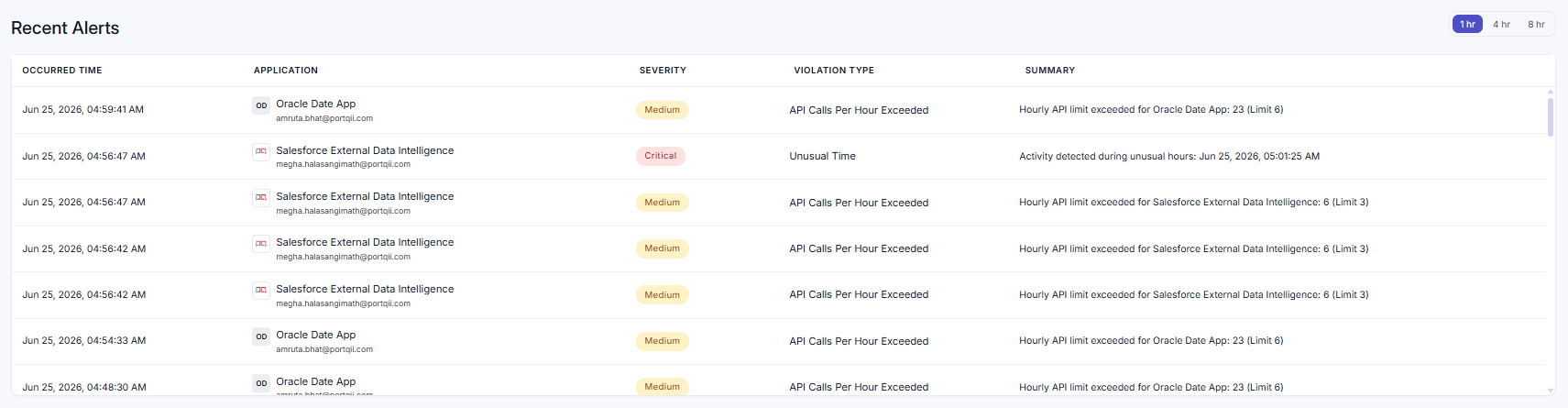
The Recent Alerts section lists the most recent violations. Use the quick time filter to show alerts from the last 1 hr, 4 hr, or 8 hr. Each row shows:
| Column | Description |
|---|---|
| Occurred Time | Date and time the violation occurred. |
| Application | The application (logo and name) and the affected user's email. |
| Severity | Colour-coded badge — Critical, Medium, or Low. |
| Violation Type | The rule that was triggered. |
| Summary | The reason for the violation, with the related resource identifier where applicable (Sync Id for Eloqua, Job ID for Salesforce). |
Violation details
Select any alert to open the Violation Details view without leaving the dashboard. It shows the full context of the incident:
- Severity
- Integration and integration ID
- User Email (and user ID, when available)
- Rule Violated
- Reason
- Recommended Action
- Violation Time and Alert Detected time
- Status — Processed or Unprocessed
- Additional Details for the event